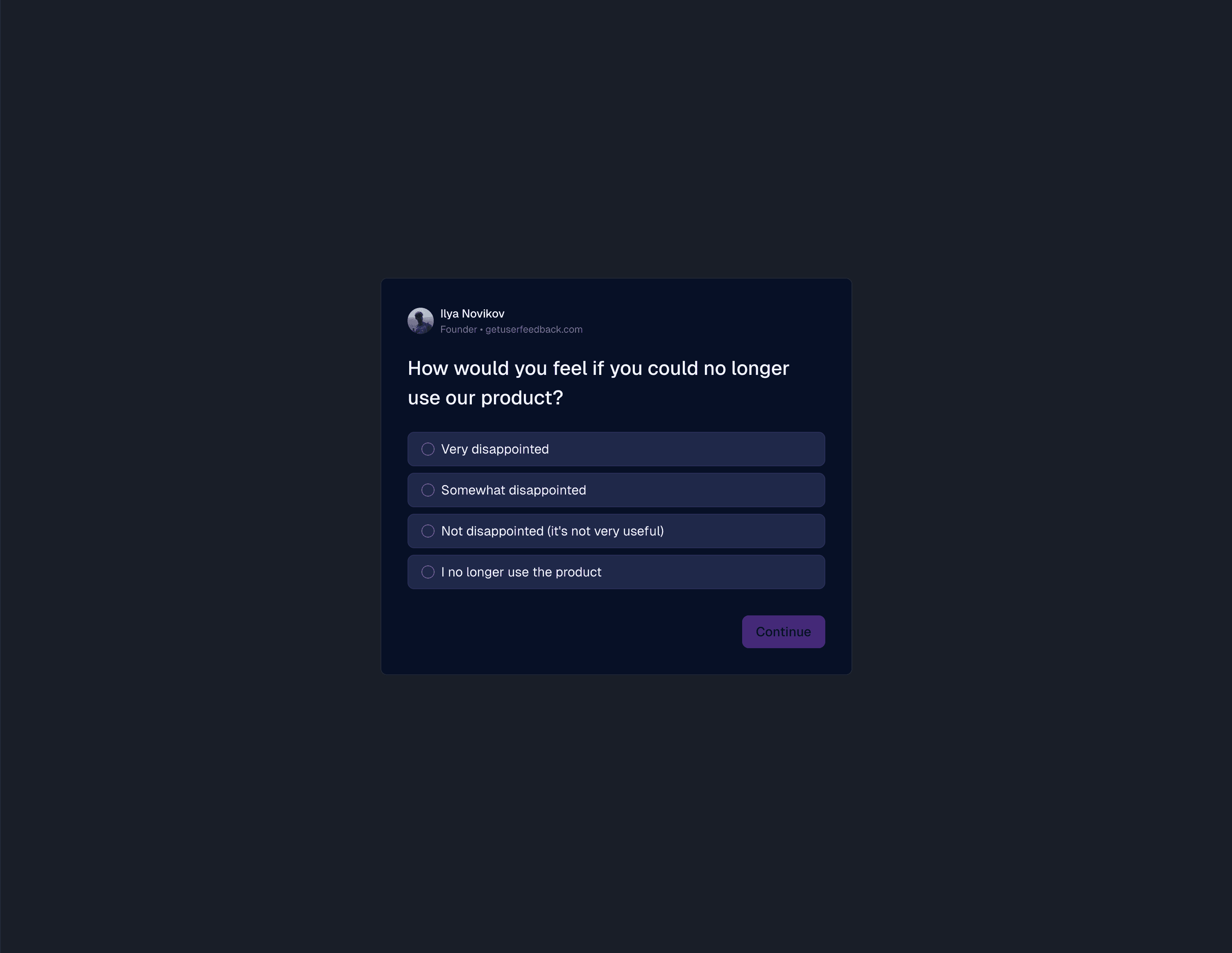
Dark mode

What's new
- System-aware dark theme across the product
- Theme is always in sync with the host application
- Polished colors, borders, and states for low-light environments
- Works in-app, on your site via the widget, and in every hosted survey
Automatic dark mode on hosted pages
Survey pages on getuserfeedback.com enable dark mode automatically based on user preferences and allow the user to toggle it manually.
Intelligent dark mode in embedded widgets
To provide a seamless user experience, the widget always matches the host application’s mode, automatically.
- If you don’t have a dark mode, the widget will never enable it.
- If you do, it will just work.
Details
We rely on industry-standard signals indicating that the host application is in dark mode.
Specifically, if there is a dark class or data-theme="dark" attribute higher up the tree.
It's ideal for sites and applications that have a dark mode and allow the user to toggle it manually.
If you manage dark mode differently, you have a few options:
- Provide a different attribute indicating dark mode (for example, a different
classordata-*attribute) viadata-host-theme-attr, or - Force the widget to a specific theme via
data-widget-theme="dark"ordata-widget-theme="light", or - If your dark mode is fully automatic (relies on user system preference
prefers-color-schemealone without a manual toggle), setdata-widget-theme="system".
Default mode
Light mode is the default (it's light unless a dark mode signal is present).
Disable theme switching
In an unlikely scenario where you need to, you can completely disable theme switching by setting data-widget-theme="light" or data-widget-theme="dark".
Written by
Ilya Novikov — Founder · getuserfeedback.com
Last updated