Change one color. The rest follows.
A theming engine's job is to make the good outcome the default and the bad one hard to reach.
By Ilya Novikov
Founder · getuserfeedback.com · Updated
Open a typical theming panel and you're looking at three hundred controls and no opinion about any of them. The two honest outcomes are an afternoon spent matching tokens by eye, or the generic default shipped with a shrug. Most teams ship the default.
That default is the expensive one. A survey rendered in type and color the surrounding product never uses doesn't read as neutral — it reads as someone else's, and people treat it the way they treat anything that wandered in from outside. What that costs is its own post; the short version is that an embedded surface only inherits the host's trust if it looks like it belongs.
So we built from the outcome backward. The default had to be on-brand rather than blank, and getting there had to be one decision rather than three hundred.
The second rule carried as much weight as the first: the surface had to be hard to misuse. A theming system that lets you produce illegible text, broken contrast, or a survey fighting its own background is a footgun, and the host will eventually pull the trigger. Sensible defaults and contrast guardrails aren't polish on the feature — they're the feature.
Good defaults beat a thousand knobs.
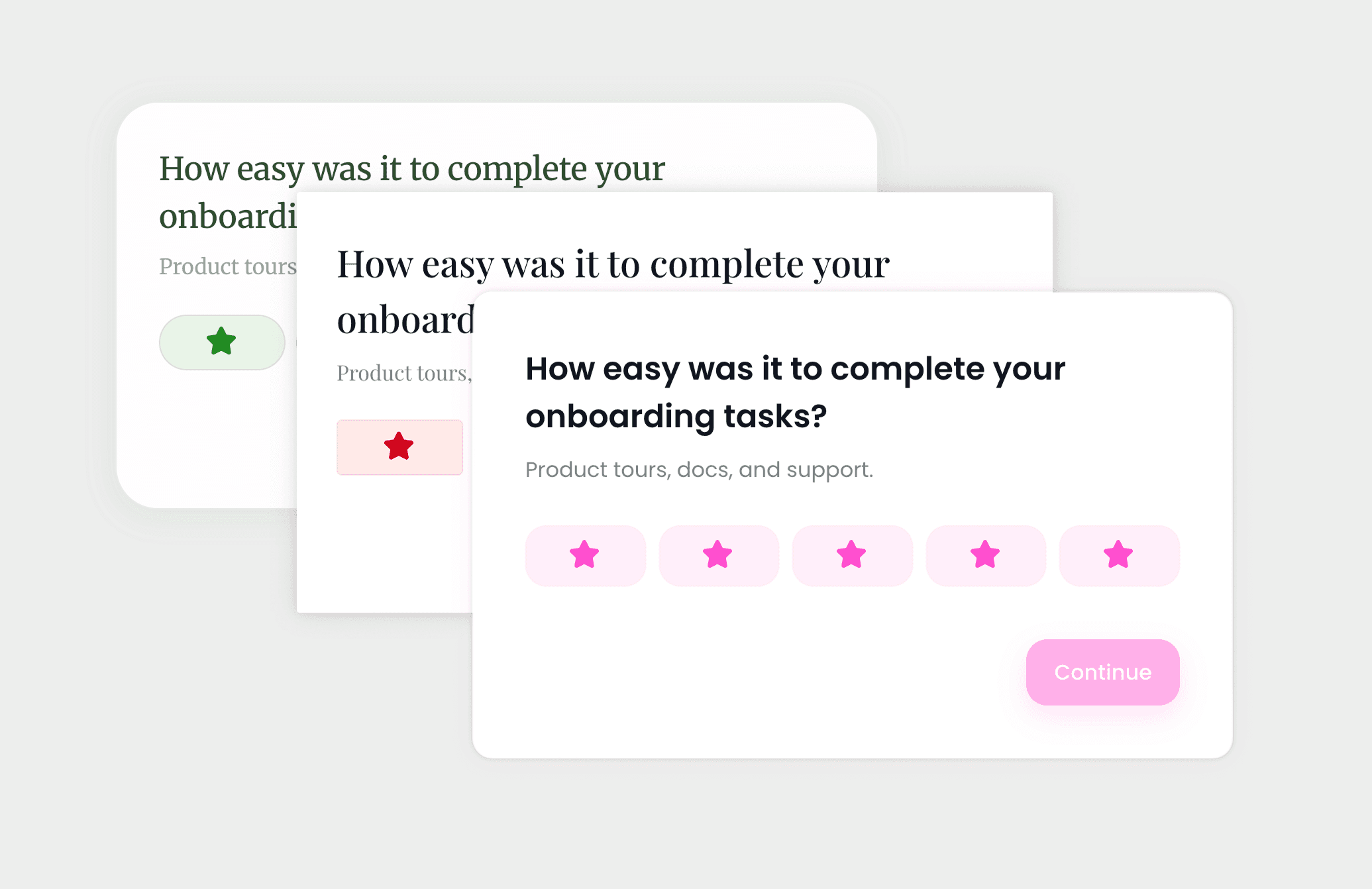
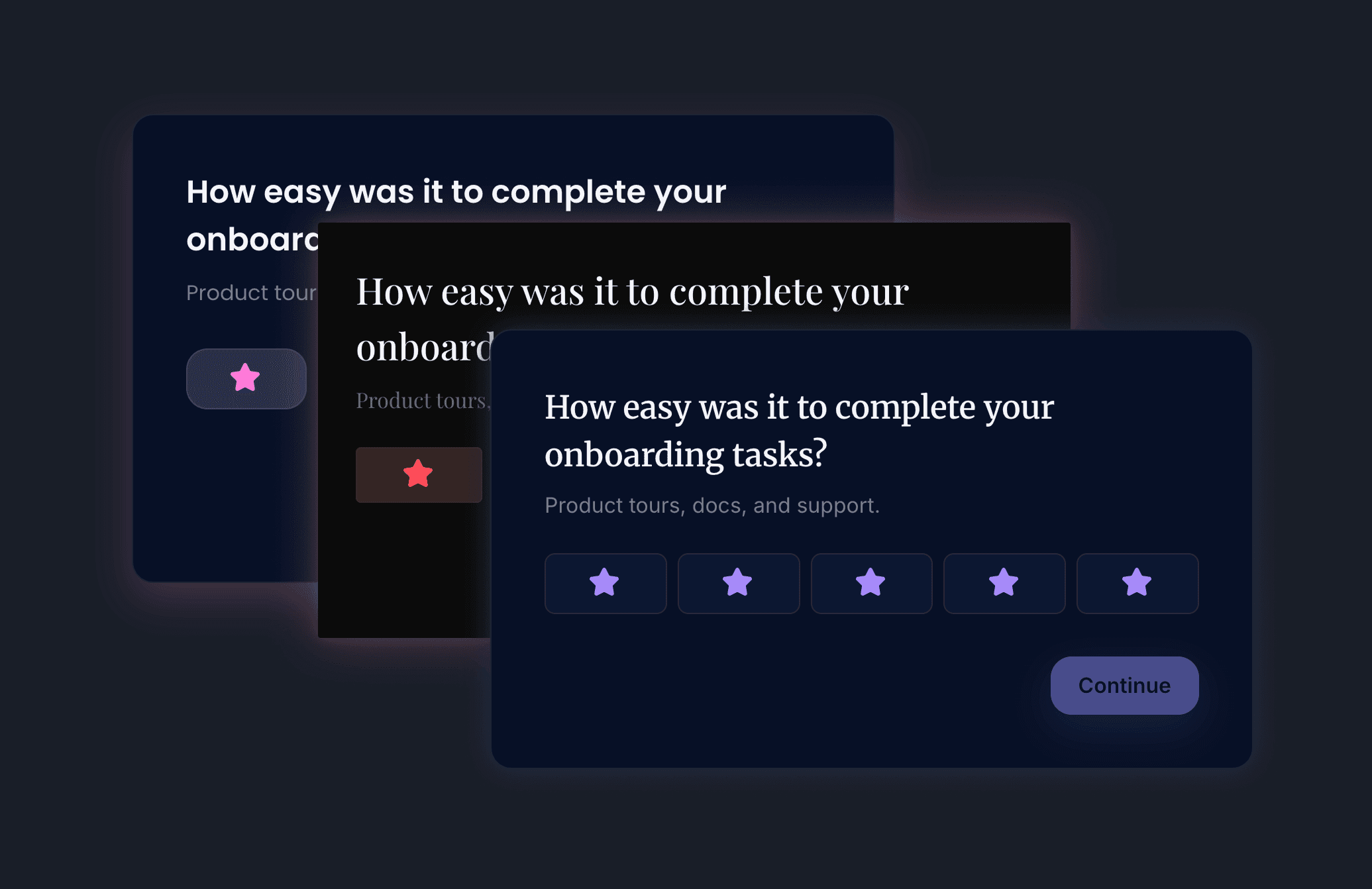
What we built starts with one input. Change the primary color and the engine derives the rest — surfaces, text, borders, states, the dark variant — in the OKLCH color space, through the standard CSS cascade, so it stays consistent and renders at browser speed. The three hundred tokens are still there: separate typefaces for headings and body, elevation, shadows, spacing, rounding, motion. They're the escape hatch for the team that needs them, not the entry fee for the team that doesn't.
AlsoThemes
Change the primary color and watch it cascade, or describe the look you want and let the editor build it.
Visit pageIf you'd rather not touch a token, describe the look in a few words and the editor proposes one; hand it your design system and it maps your values onto ours. Dark mode isn't a second theme to maintain — it inherits from the light one and stays in step with the host. If the product around it has no dark mode, the widget never forces one; if it does, the widget is already there. Setup is in the theming docs.
The token count was never the point. The point is that the version of your survey that looks like everyone else's should be the one that takes effort to ship — the one that looks like you is what you get for free.